Maintenance Made Easy
One of the most common complaints I hear is how cumbersome it is to get to a maintenance screen. This problem is very easily solved.
Here's a sample from one of my systems. A "contact name" has to be entered:
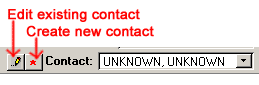
(These two buttons could be labeled any way you want them to be)
Here's the entire screen:
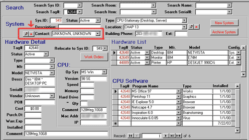
The appropriate contact name isn't in the drop-down list so they have to add a new one. Typically, they'd have to exit out of this screen, call up a menu, go to a "Contact Maintenance Screen", add the new contact, then work their way all the back... assuming they could remember where they were.
In my system, however, all they have to do is click the "star" button (*) - and this is what they get:
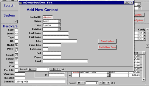
Of course, as soon as they click the "Save/Update" button, they return to the screen they started from and the new name is now available in the drop-down list of contacts. If appropriate, the system can even automatically put the new name in the contact box.
Note that they are also given the option to Quit without saving in case they change their mind. Again, they can keep working from where they left off.
It's absolutely critical that all systems be designed like this
or you'll get unhappy, unproductive users. Could your system use a little
improvement? I'd be happy to help.

|
Peck Tech Designs - consultants providing creative custom software development,
integration, Internet web site programming, database design, and application and data
conversion to clients in Connecticut and throughout the USA.
Copyright © Rachel Peck 2003 - all rights reserved |